“A brand for a company is like a reputation for a person. You earn reputation by trying to do hard things well.”

— Jeff Bezos

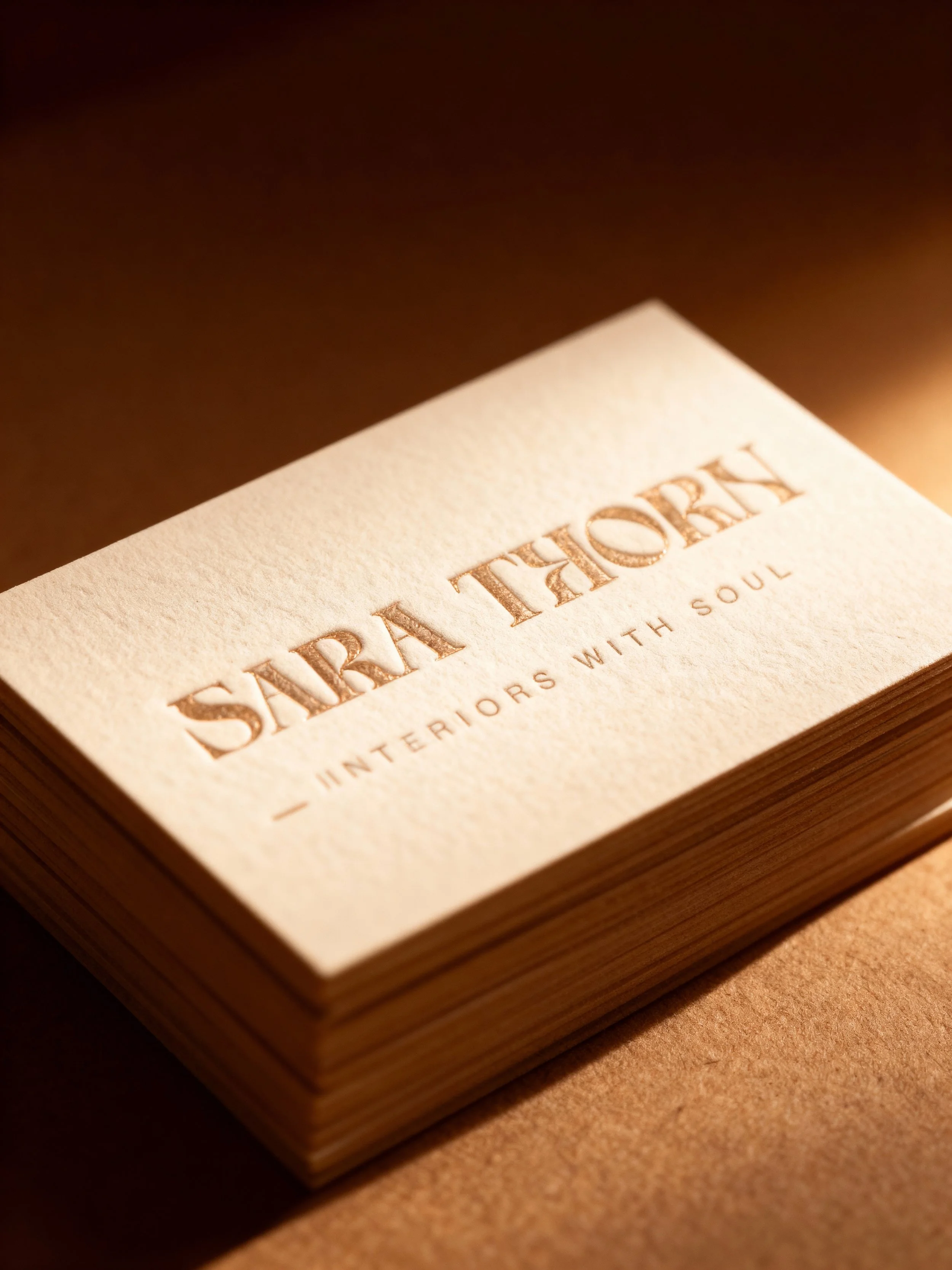
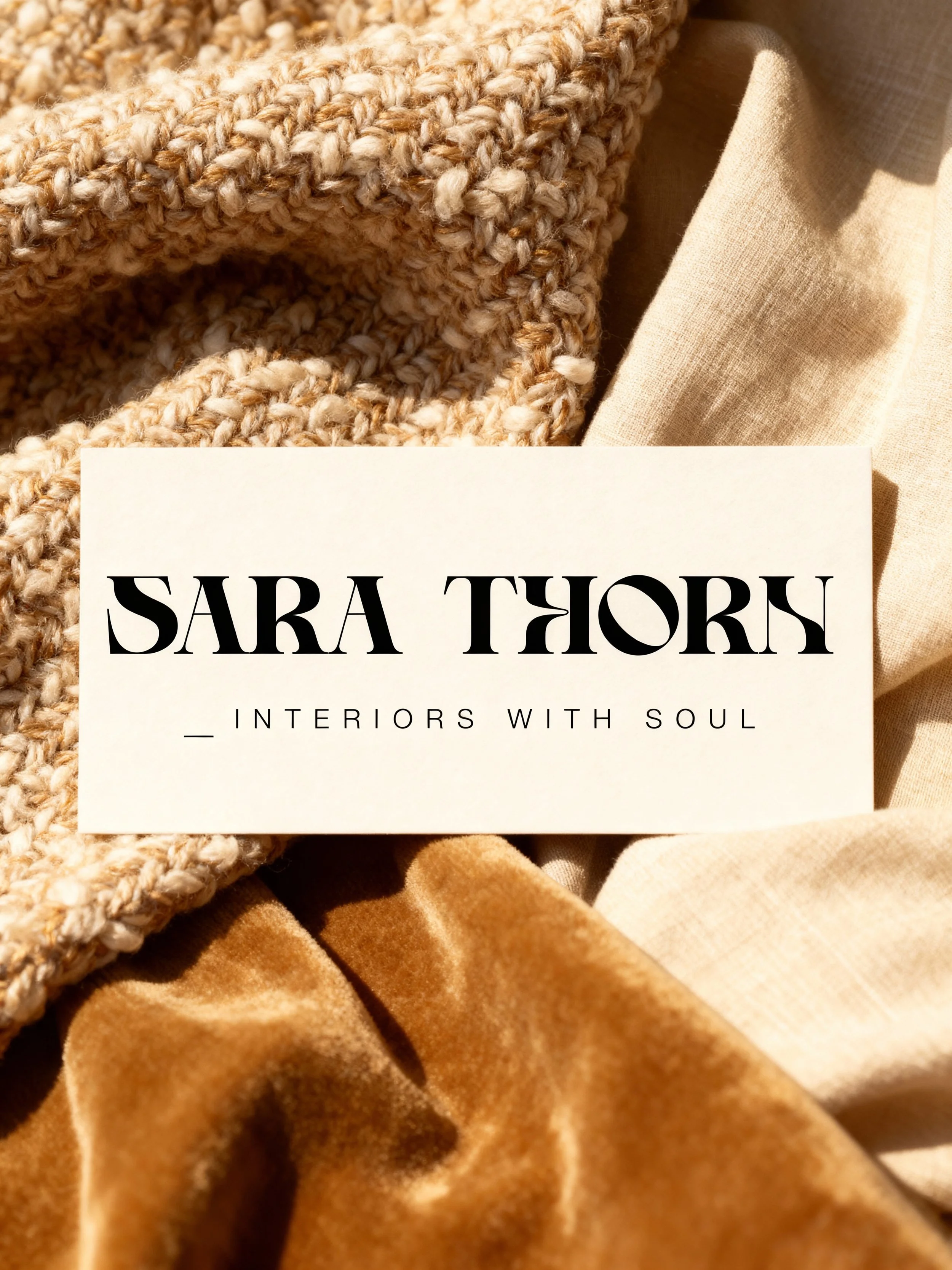
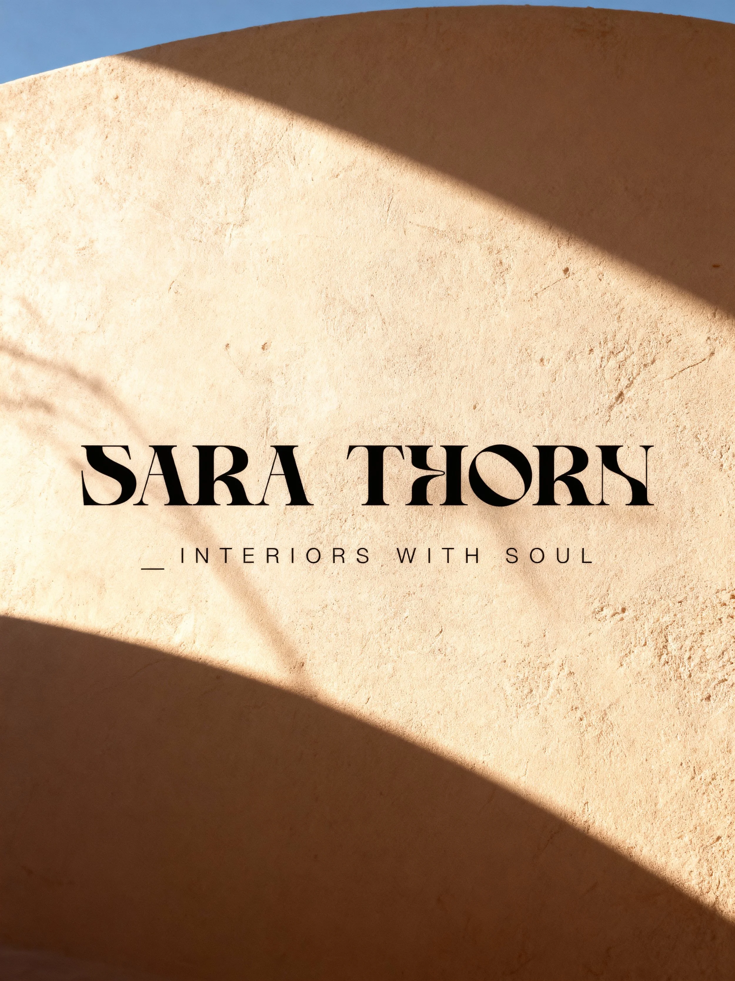
BedeckWork with Sara Ajram was a highly professional and organic process. Sara provided me with an insight to the emotions and expressions she wanted her brand to manifest aesthetically and visually. I particularly enjoyed this project because Sarah knew exactly what she wanted and gave me total freedom with uncovering a visual language that displayed the essence of her brand. My aim for the brand identity was to show that simplicity is beauty with a personalized approach. The logotype is made up of a combination of a script typeface and san serif. The script typeface represents the bespoke approach of the brand while the san serif signifies the modern and minimal style. The logotype is centered within a rectangle. A rectangle is a familiar and trusted shape and suggests honesty. It is seen as earthbound and nestles the logotype beautifully inside resembling a beautiful home. The name of the brand was later on changed from Bedeck to Sara Thorn as per client request.

Bedeck

Working with Sara was a seamless blend of professionalism and creativity. She shared insights into the emotions she wanted her brand to convey visually. I loved this project because Sara gave me the freedom to uncover a visual language that captured her brand's essence. The aim was clear: to showcase that simplicity is beauty, personalized. The logotype, a blend of script and sans serif, symbolizes bespoke and modern minimalism. Centered in a rectangle, it suggests trust and nests the brand like a beautiful home. Note: The brand name transitioned from Bedeck to Sara Thorn at the client's request.

RL Business mockup.jpg

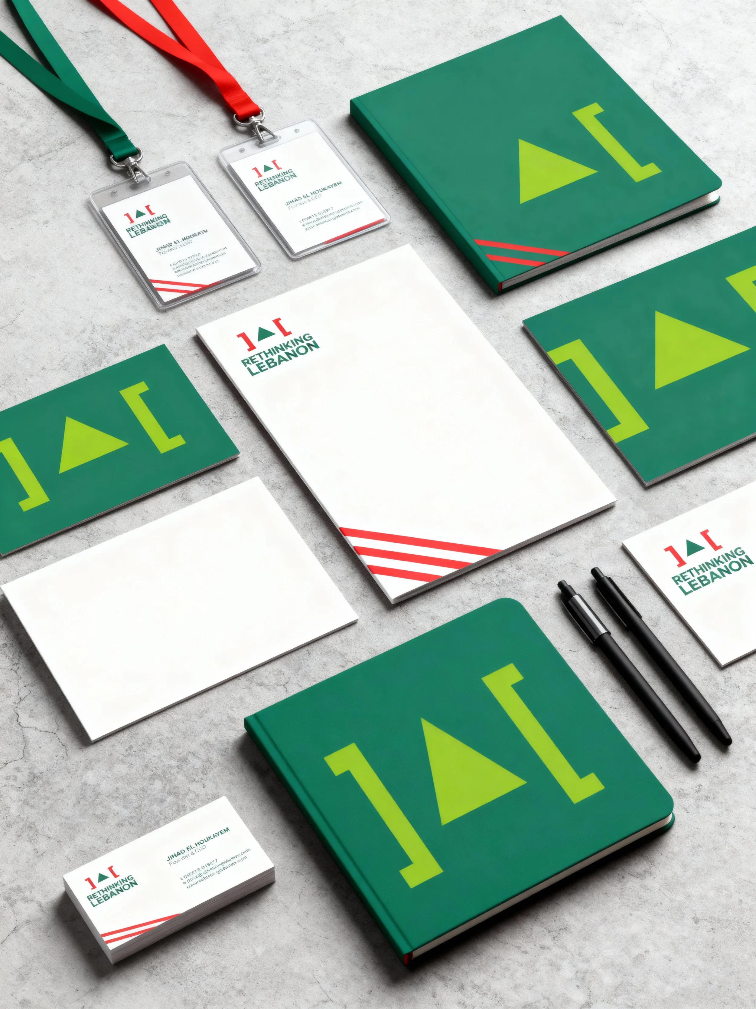
Rethinking Lebanon


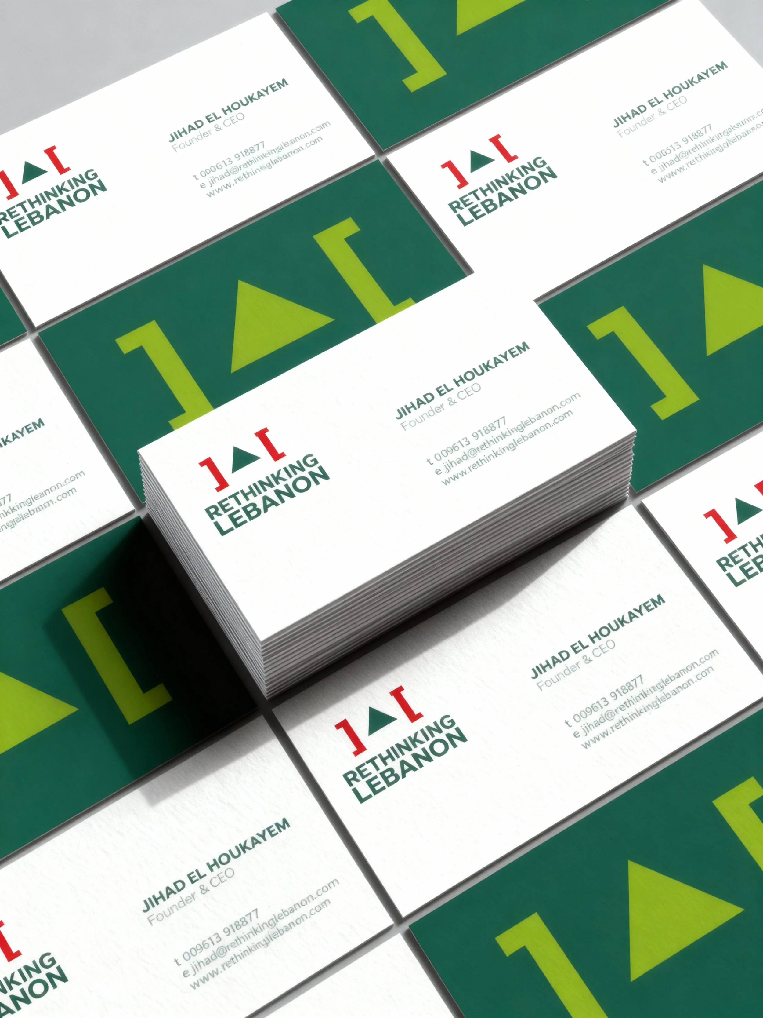
This project is close to my heart—it's about Lebanon and breaking free from sectarianism, favoritism, and nepotism. Commissioned by Jihad al Hokayem, the goal was clear: create a brand identity that inspires youth leadership and fosters change. The focus? Transforming apathy into engagement and cultivating a mindset of leadership. The reinvented Lebanese flag in a minimal style reflects the brand's fresh approach. The triangle symbolizes the iconic cedar tree with a progressive twist, boldly placed outside the box. The contemporary sans-serif typeface, in uppercase, echoes the brand's impactful essence.

Wrapped Gift .jpg

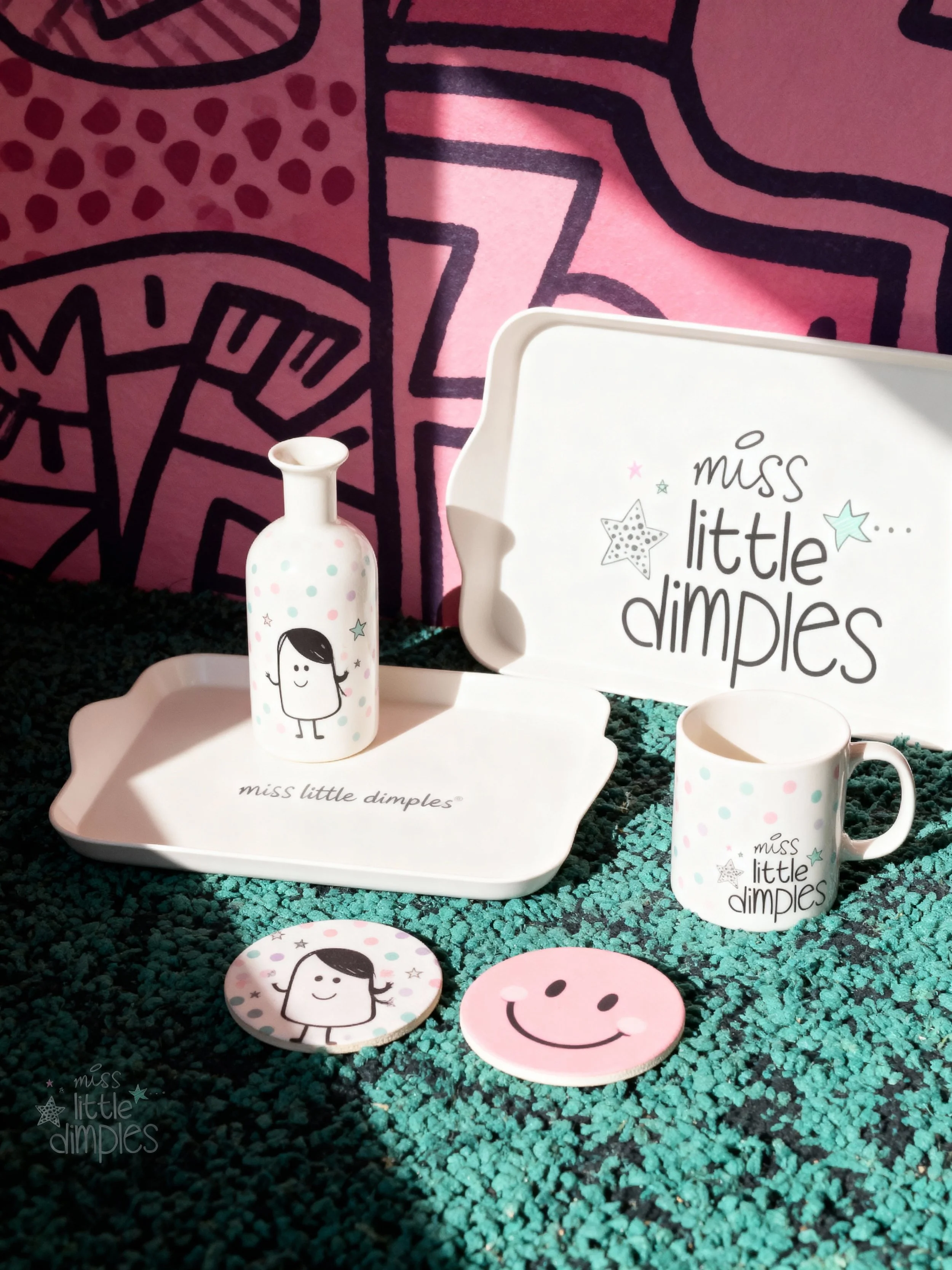
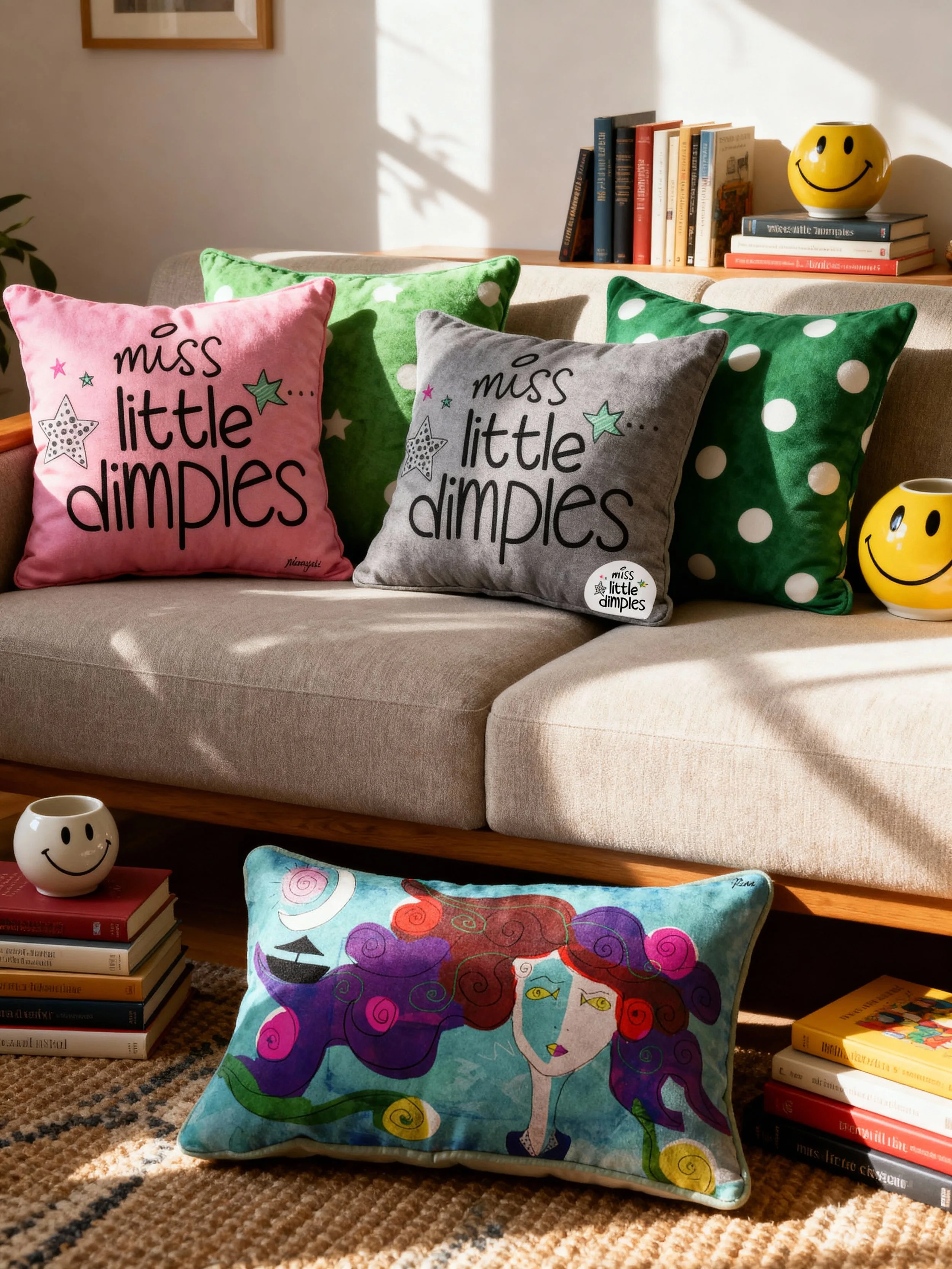
Miss Little Dimples

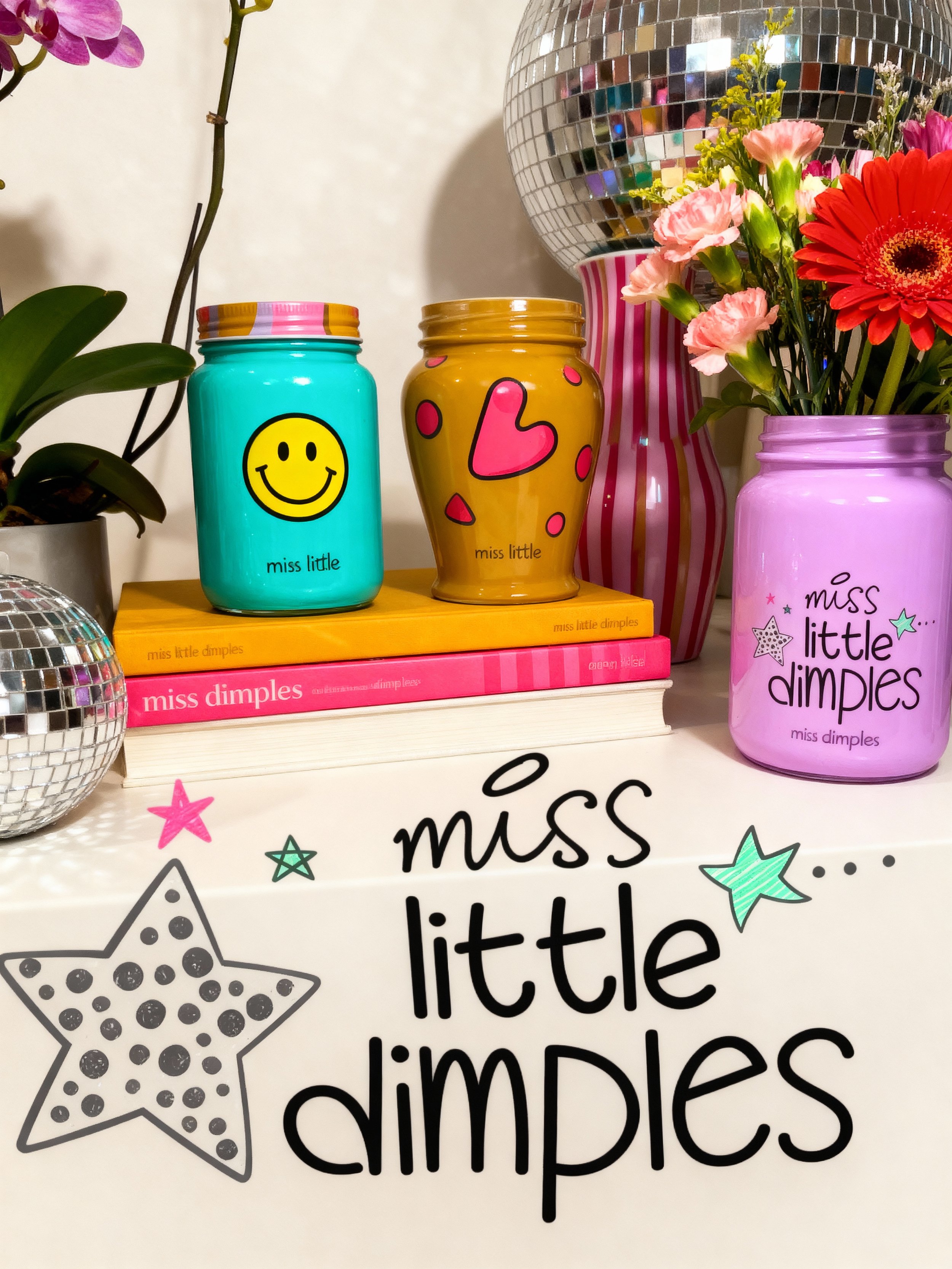
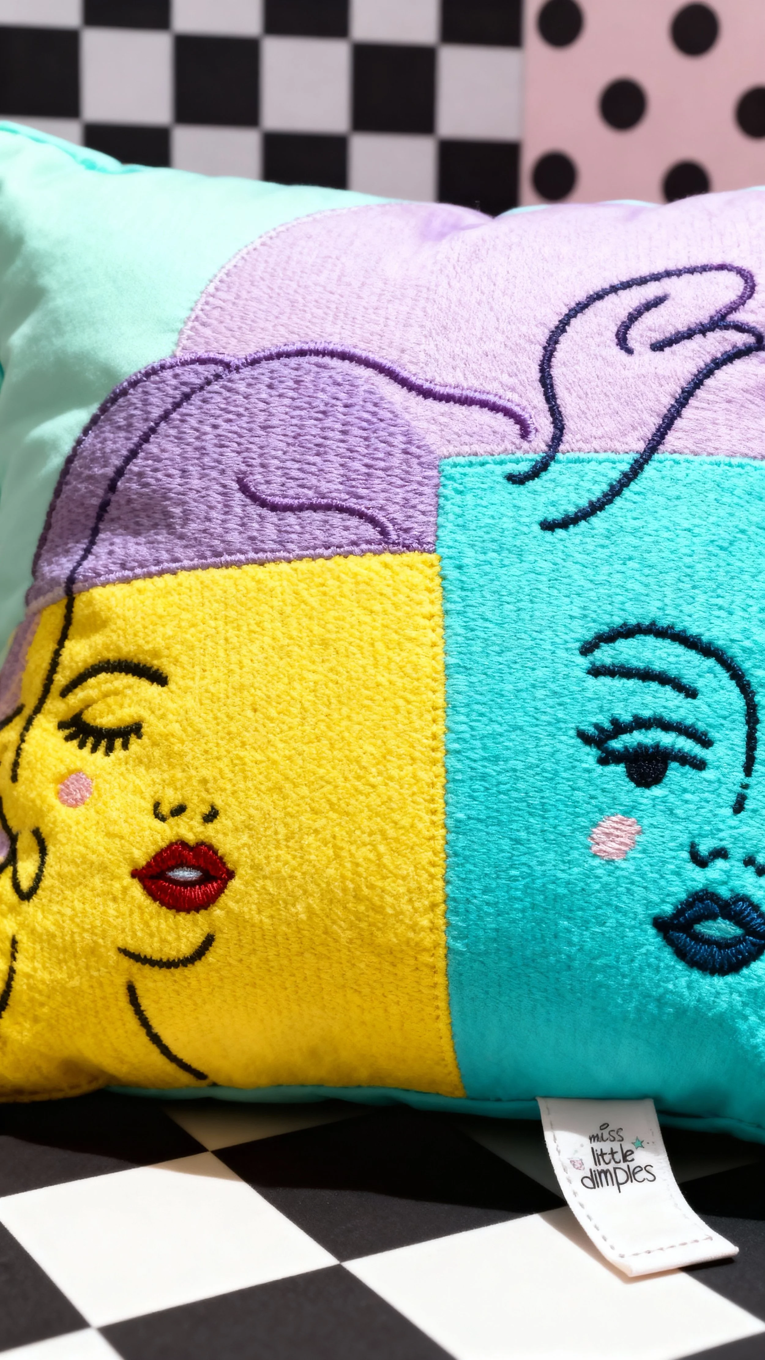
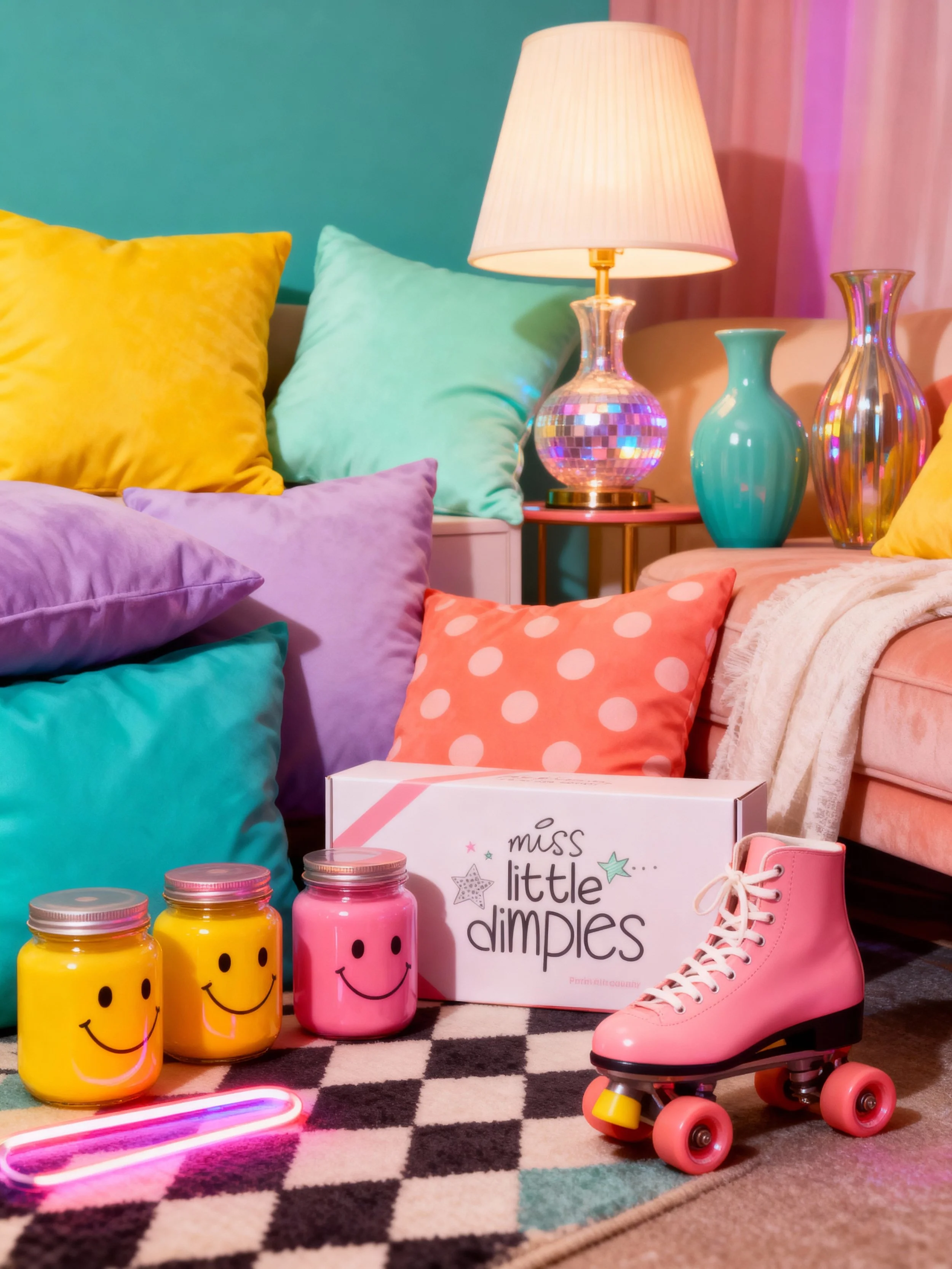
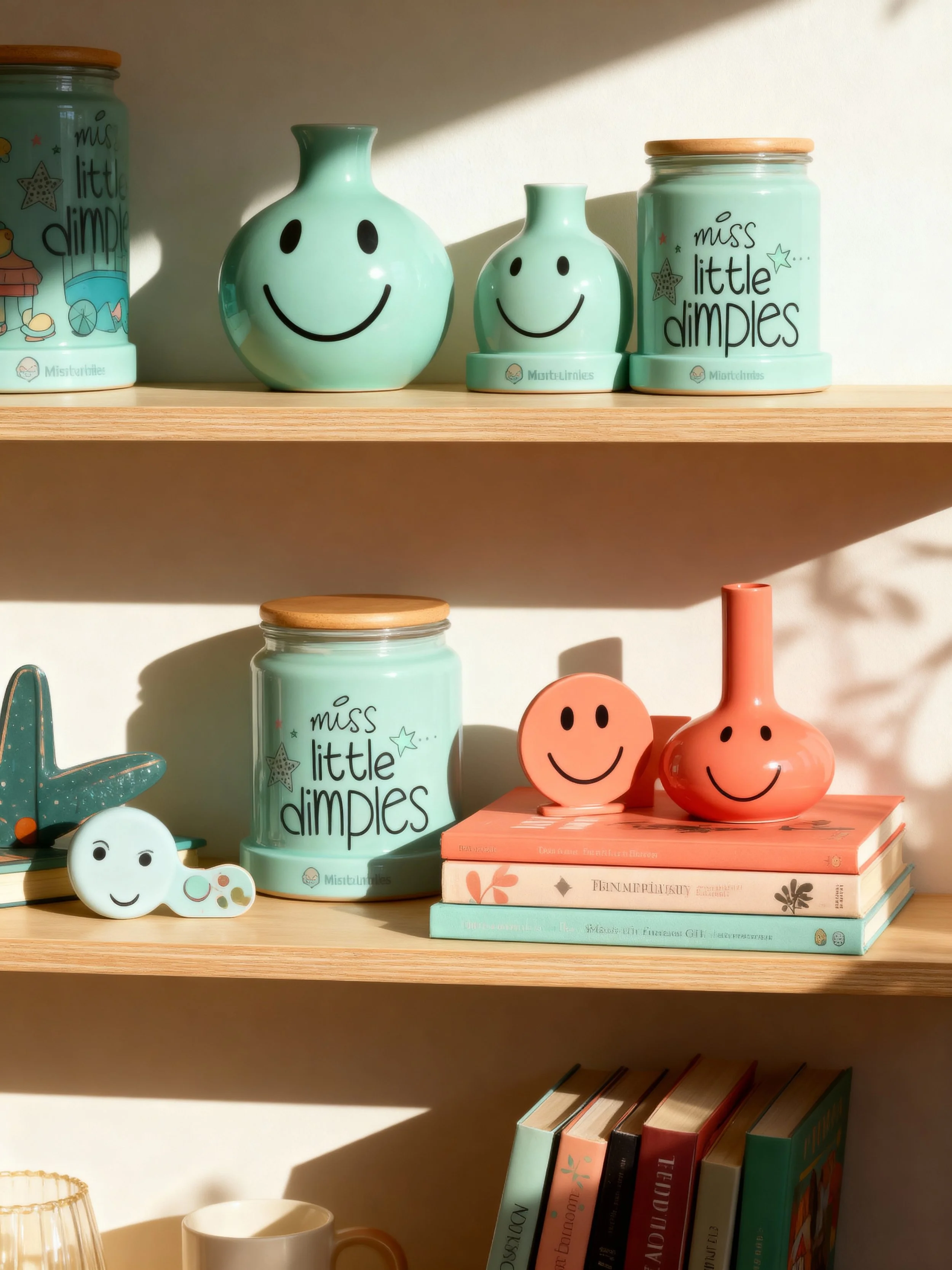
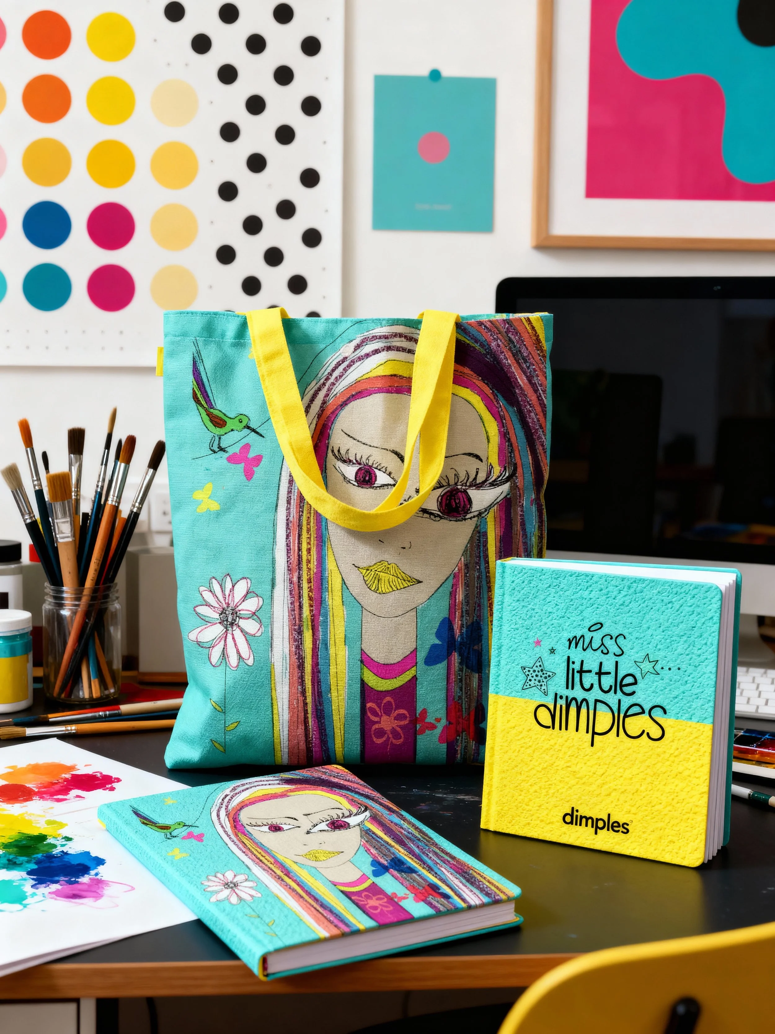
Meet Miss Little Dimples—an online startup I founded to bring a dash of style, eclecticism, and imagination to your home decor. Our vibe? Stylishly quirky and unapologetically whimsical. We're all about inspiring creativity, making your space magical, and crafting beautiful memories for you and your little ones. Our brand identity? It's as vivacious as it gets—think quirky illustrations, fairytales, and a burst of bright colors and typography that capture the essence of whimsy and warmth. Ready to transform your space into a realm of twinkles and giggles!

TarteletteNahla Zeidan is a Lebanese baker, food writer and food stylist. She owns and runs Tartelette. Nahla wanted to brand her business and asked me to propose a design for her image. It was a real treat for me working on this project with Nahla! Besides the incredible desserts that we devoured over our brainstorming sessions, the process was seamless, professional and exciting. The result was a visual narrative that represents a homemade, home baked, delicious and warm dessert created with utmost sophistication, originality & French inspired passion for good taste and healthy ingredients. The brand identity embodied those important values with the delicate handwritten typeface that is interlaced with a floral design. The visual language is bespoke, dainty and has an organic feeling to it that lends a quality of tastefulness and intricacy.
Tartelette

Meet Nahla, the creative force behind Tartelette—Lebanese baker, food writer, and stylist extraordinaire. Working on her brand was a treat! Amid mouthwatering desserts and seamless professionalism, we crafted a visual story. Imagine a homemade, French-inspired passion for good taste—translated into a brand identity. Delicate handwritten typeface intertwined with florals, a bespoke, dainty, and organic feel that exudes tastefulness and intricacy. Tartelette's brand is more than a visual feast; it's a flavorful journey.

Abu Dhabi Investment HouseThis is a project I’m particularly proud of as a major client win in a new business pitch at Impact BBDO Beirut (freelancing). Abu Dhabi investment house (ADIH) was established in 2005 by a combination of leading financial institutions and a group of prominent businessmen and investors from the Gulf region. ADIH was looking for a brand identity that resonates investment, security, prosperity and opportunity. The brand identity I created was a minimal/contemporary visual narrative of a cordial house, with an open door that lends a quality of generosity, security, affluence  & opportunity. The colors evoke trust and reliability, while the typography is modern and structured blending both languages seamlessly together.
Abu Dhabi Investment House

Achieved a significant milestone while freelancing at Impact BBDO Beirut—a major client win with Abu Dhabi Investment House (ADIH). Founded in 2005 by leading financial institutions and influential figures from the Gulf region, ADIH sought a brand identity exuding investment, security, prosperity, and opportunity. My crafted visual narrative showcases a minimal and contemporary depiction of a welcoming house with an open door, symbolizing generosity, security, affluence, and opportunity. The chosen color palette instills trust and reliability, while the modern and structured typography seamlessly blends both languages. This project stands as a testament to strategic creativity and effective communication.

Business card.jpg
 

Nayla Real Estate

Nayla LLC: where real estate meets Vermont's beauty! They invest in commercial gems—office buildings, apartments, hotels, and more. When the team sought a brand identity, I stepped in. Picture this: an intricate, handwritten logotype flowing into a beautiful leaf—a bespoke image capturing Nayla LLC's essence. And those gold-stamped business cards? Pure luxury and elegance, understated but oh-so-stylish.

Next
Next

Advertising